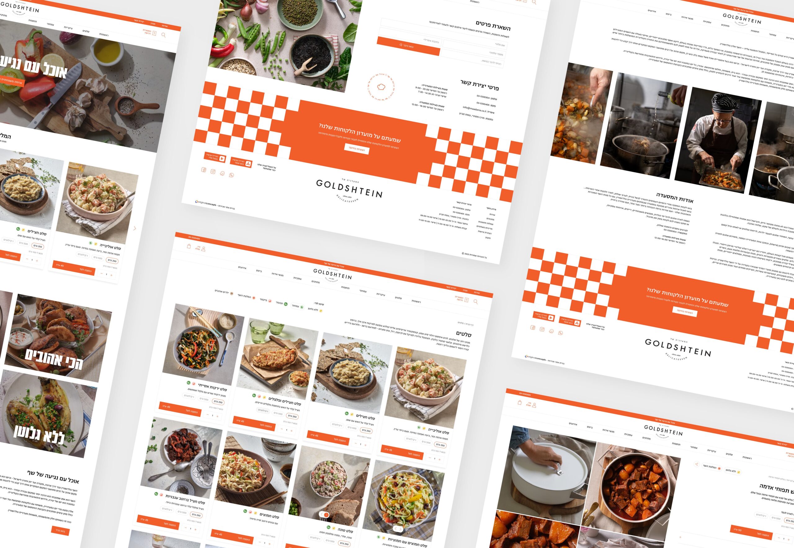
Goldshtein is an established deli that wanted to grow its online orders — but its old site was dated and didn’t work well enough to get there.
It also has one detail that makes it genuinely hard to sell online: the menu changes every day, with special items for weekends and holidays.
I was the sole designer, from research to final responsive design, and brought the deli’s new branding into the site so it finally matched the quality of the food.
Year
2024
Industry
UX Research, UI Design, Responsive Website Design
Tools Used
Figma, Photoshop, Illustrator
The old site had two problems. It looked dated — reason enough on its own to rebuild — but the harder, deeper issue was how it worked.
A normal online store assumes the menu stays the same: you browse, add to cart, and pick a delivery time at the end. Goldshtein’s menu doesn’t stay the same. What’s available depends completely on the delivery date.
That created a chicken-and-egg problem:
The old site never solved this, which is exactly why ordering felt confusing and orders were being lost.
My goal was to beat the ordering experience customers were getting everywhere else, so I started by studying how other delis and food-ordering sites handled scheduling and menus that change by date.
A clear pattern came up:
That gap was the opportunity. If I could make picking a date feel natural instead of like a gate, the whole experience would stand out.
Instead of making scheduling a separate checkout step, I built it into the moment people show they want something: adding the first item to the cart.
How it works:
This turned scheduling from a barrier into a natural part of ordering. No cart that breaks at checkout, and no need to commit to a date before seeing anything worth buying.
Bringing in the brand.
I integrated the deli’s new branding throughout, so the site felt like a real extension of Goldshtein rather than a generic ordering template.
Clear, not just pretty.
I kept the menu simple to scan and the path to checkout short, so the daily and holiday specials were easy to find without adding clutter.
Mobile-first.
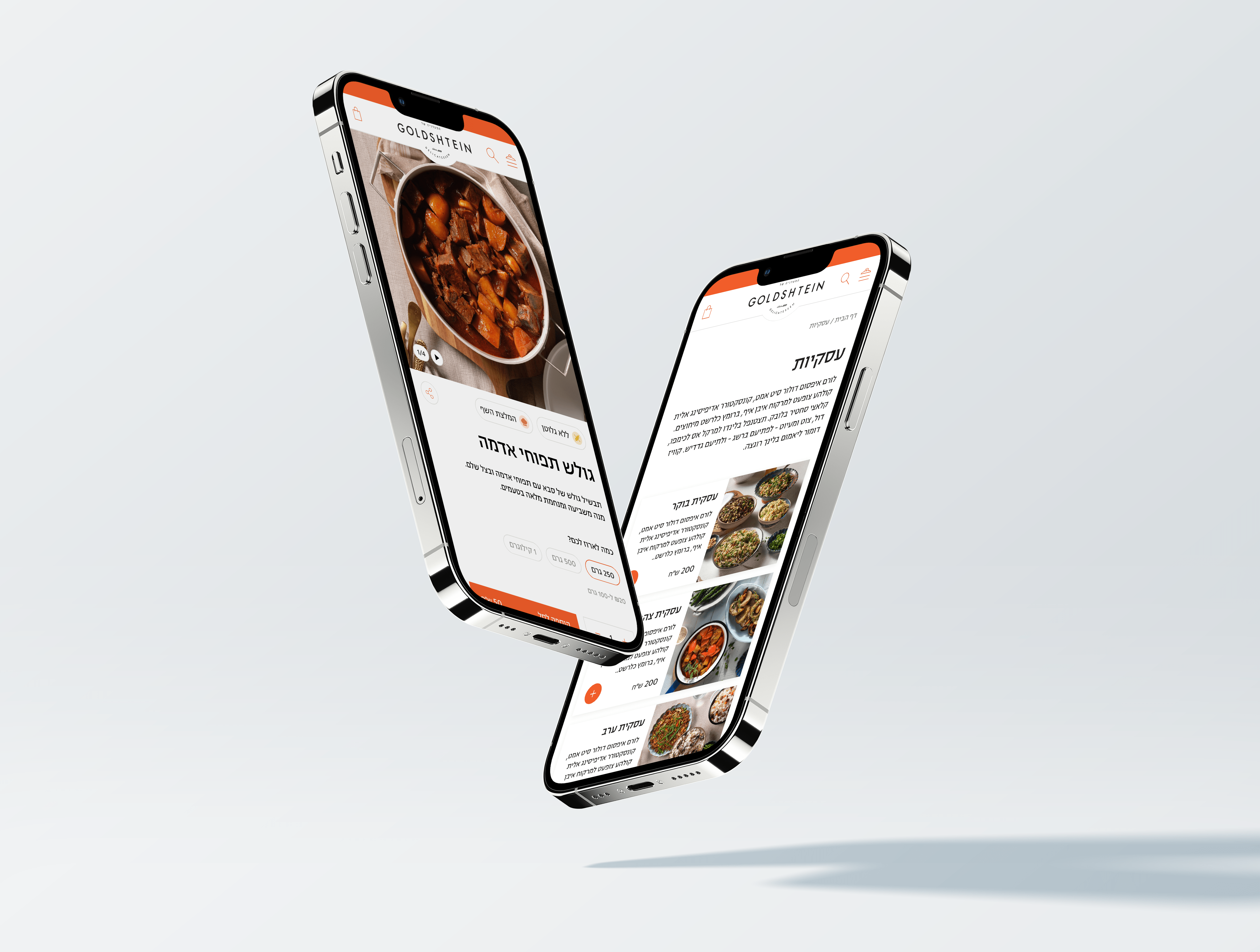
Most food orders happen on a phone, so the whole flow — browsing, picking a date, checking out — was built to feel just as easy on mobile as on desktop.
The redesign gave Goldshtein a modern site that finally matched the quality of the food.
But more than a fresh look, it fixed what was quietly costing orders. What began as the deli’s hardest problem turned into one of the smoothest parts of ordering. And the whole site was rebuilt to support the growth the business wanted.
The hardest design problems are usually about how something works, not how it looks.
The interesting part here wasn’t making the site look good. It was figuring out the order in which to ask for information, so a genuinely complicated setup — a menu that’s different every day — felt easy for someone just trying to order lunch.