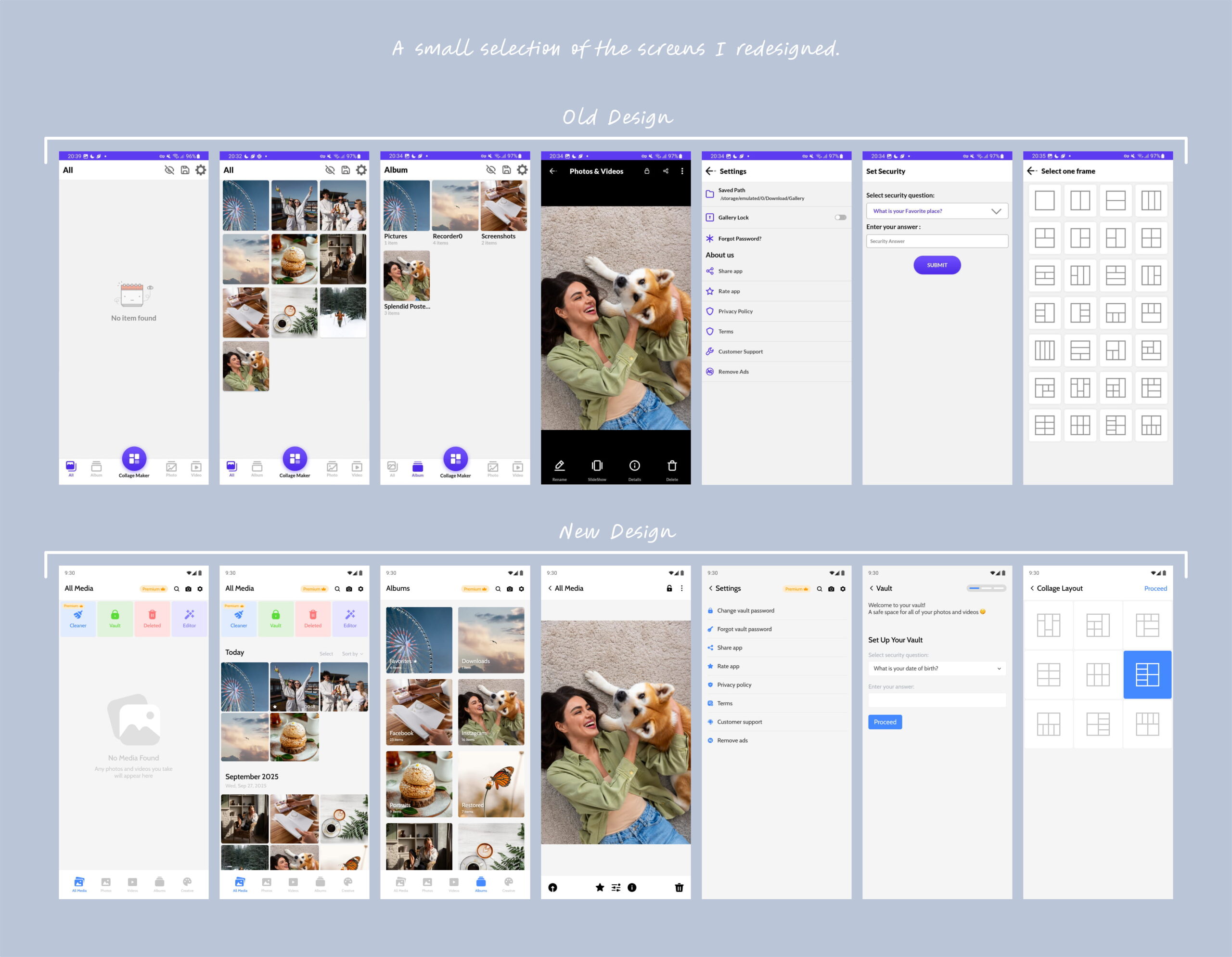
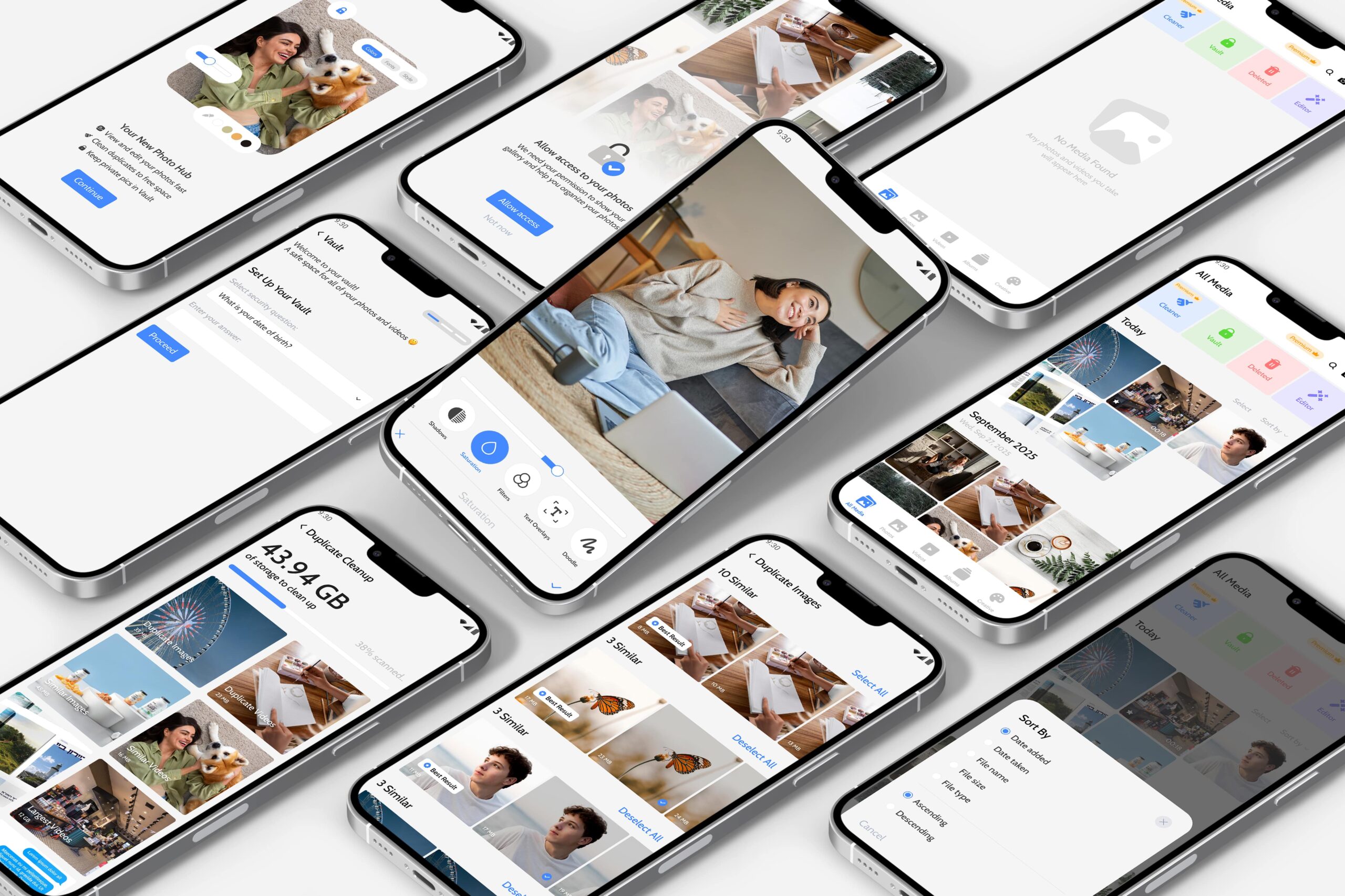
Gallery is a photo app that had fallen behind — a dated look and a thin feature set that no longer matched the client’s vision, or what people expect from a gallery app today.
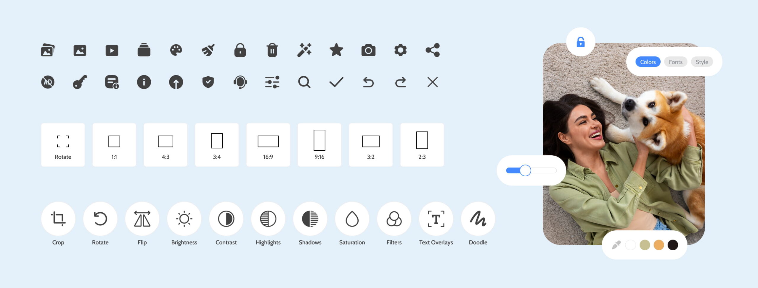
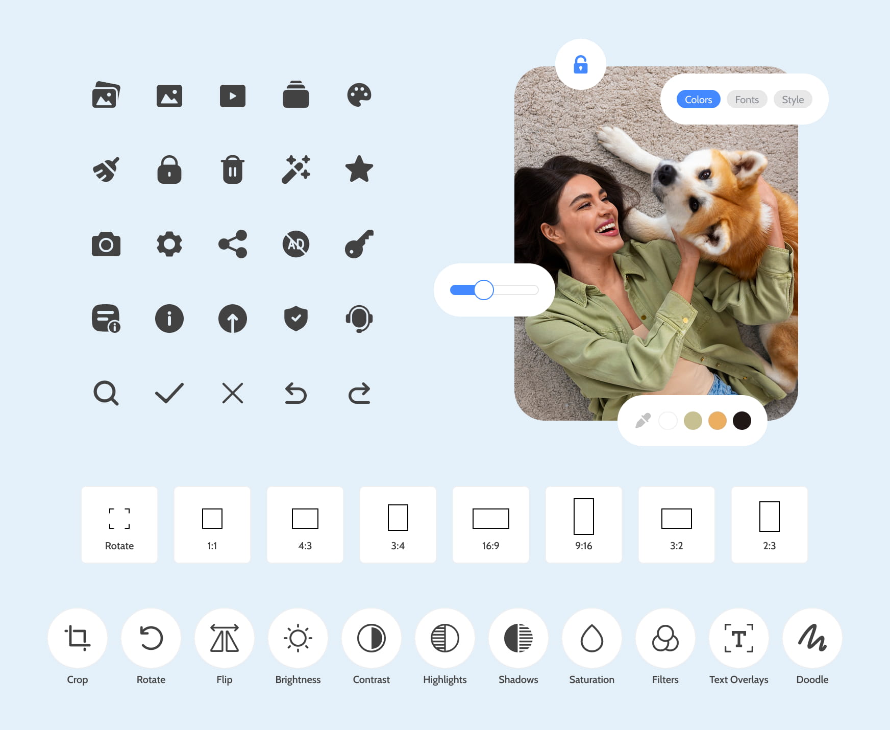
I redesigned it end to end: a fresh interface plus a set of new tools — a duplicate cleaner, fuller editing, onboarding and permission screens, a recently-deleted folder, dark mode, and landscape support.
Year
2025
Industry
Media
Scope of Work
UX Research, UI Design, App Design
Tools Used
Figma, Photoshop
The Challenge
More features usually means more clutter. The hard part wasn’t building a duplicate cleaner or editing tools — it was adding all of them without turning a simple app into a confusing one.
The old interface didn’t help: it was dated and loosely structured, with no clear home for anything new.
Research & Discovery
I mapped the new features against what people actually expect from a modern gallery app — clearing duplicates, quick edits, a safety net for deleted photos, dark mode.
The takeaway: the value wasn’t in more features, but in making each one feel obvious.
The Solution
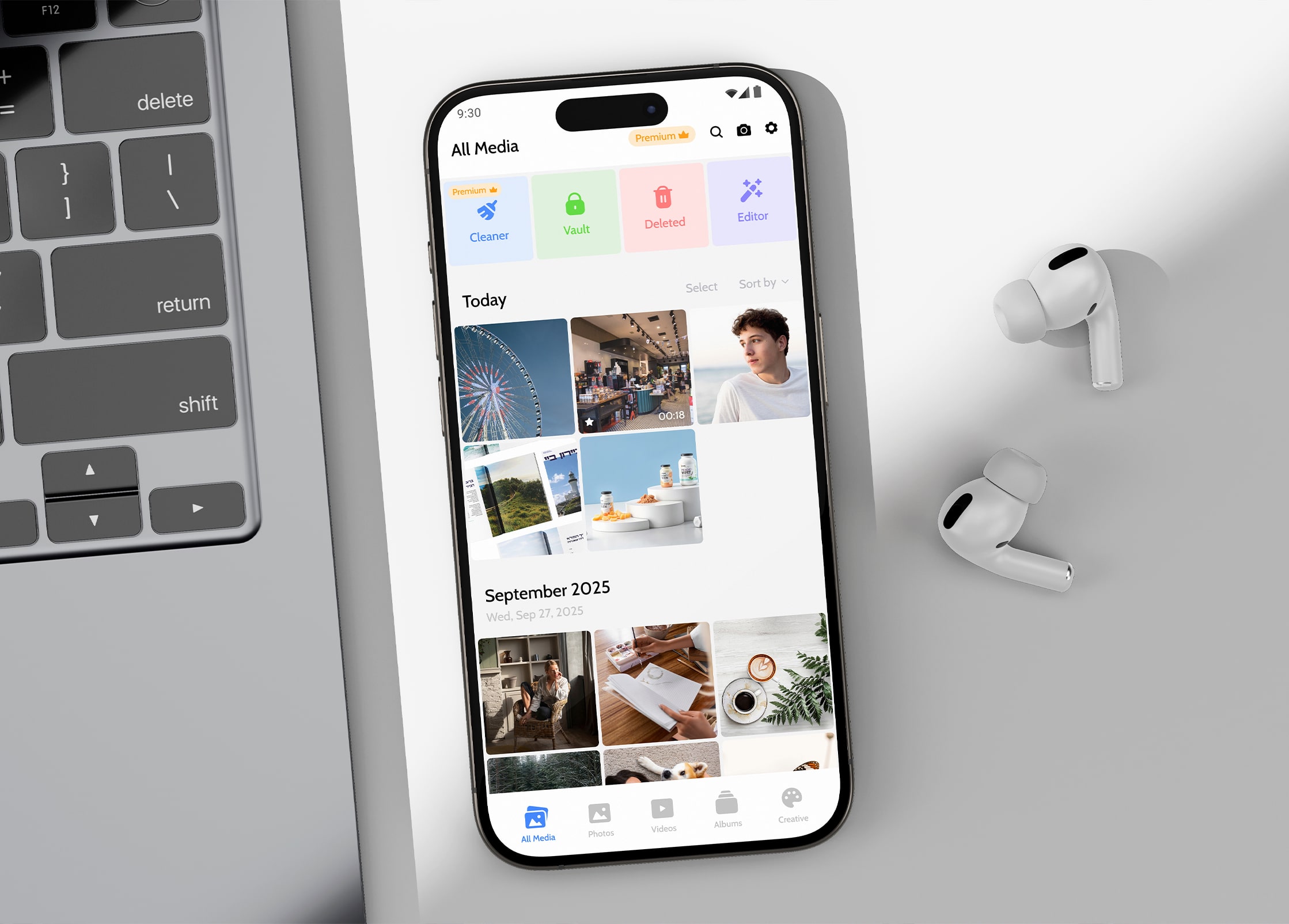
I gave every feature a clear place to live, so the app stays easy to scan even with more inside it.
The visual style was modernised and made consistent, which does much of the navigation work on its own.
And the heavier actions — duplicate cleaning, photo editing — were broken into clear, guided steps, so they feel controlled instead of overwhelming.
The Result
The result is a photo app that does noticeably more, yet feels simpler to use than before.
The new tools sit naturally inside a clean, modern interface — so it feels more capable without ever feeling crowded, and stays easy to navigate whether you’re clearing out duplicates or just browsing your photos.
What I Took From It
The real skill here wasn’t adding features — it was hiding their complexity. Anyone can pile more tools into an app; the hard part is making sure it still feels effortless afterward.
Growing an app while keeping it simple comes down to one thing: giving every new feature a clear, obvious place to belong — so the app feels fuller, never heavier.