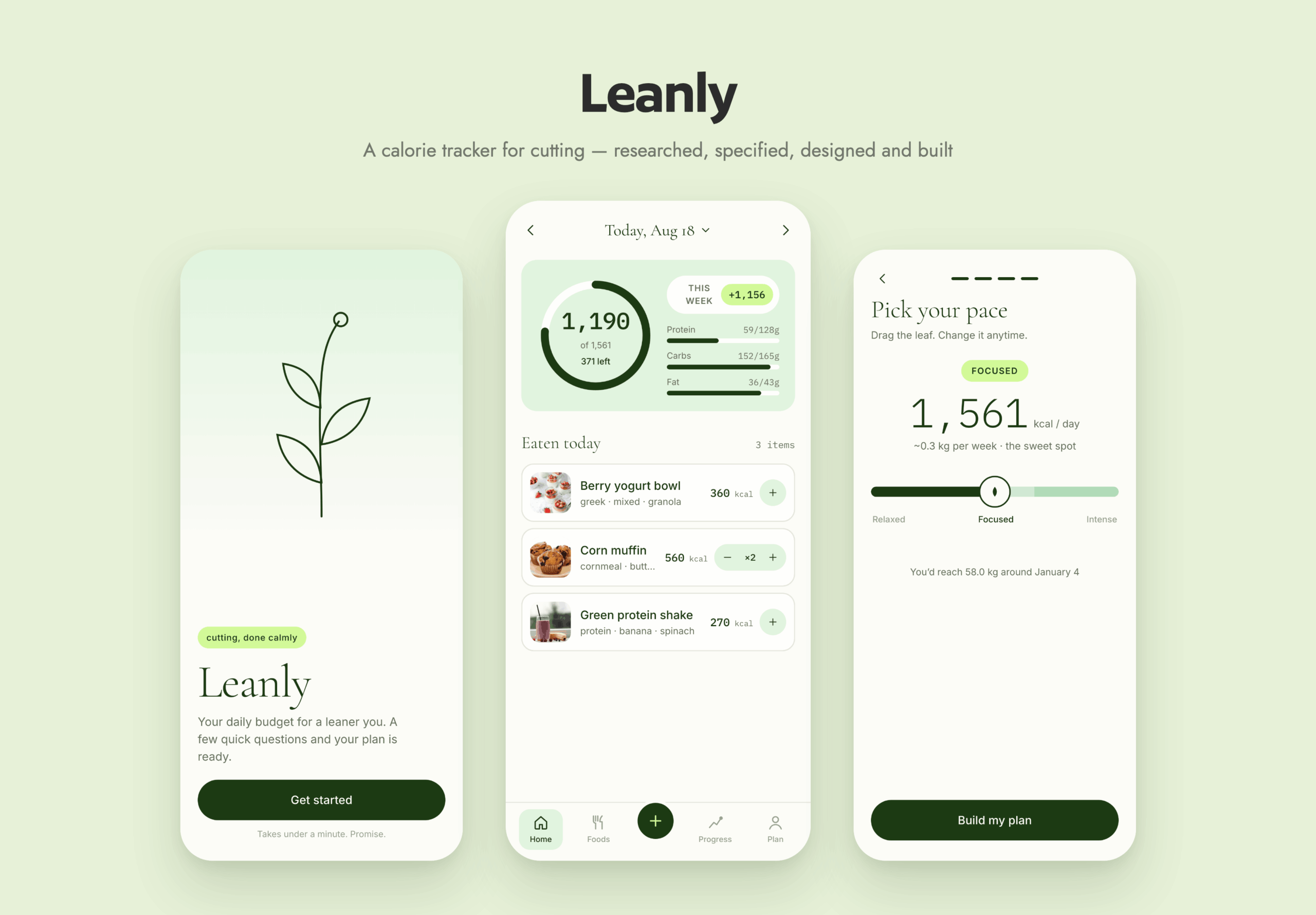
I wanted to get fitter and start properly tracking what I ate – so I built an app for it.
That’s a sentence that wouldn’t have been realistic for me a couple of years ago. With AI it is – a designer can take an idea and carry it all the way to something that runs.
So I made exactly the one I wanted: calm, quick to log, and honest about where I stand.
The real work turned out to be the directing. Knowing what to ask for, what to send it away to research, which references to point it at, and when to hand something back.
Year
2026
Industry
Product Definition, UX Research, UI Design, Brand, AI-Directed Build
Tools Used
Claude Code
I knew the app I wanted. What I didn’t know was how to get an AI to build exactly that.
An AI will build whatever you describe, including the wrong thing, and it will do it confidently. So the real challenge was never the app. It was learning to describe what I wanted precisely, and to spot quickly when the result wasn’t it.
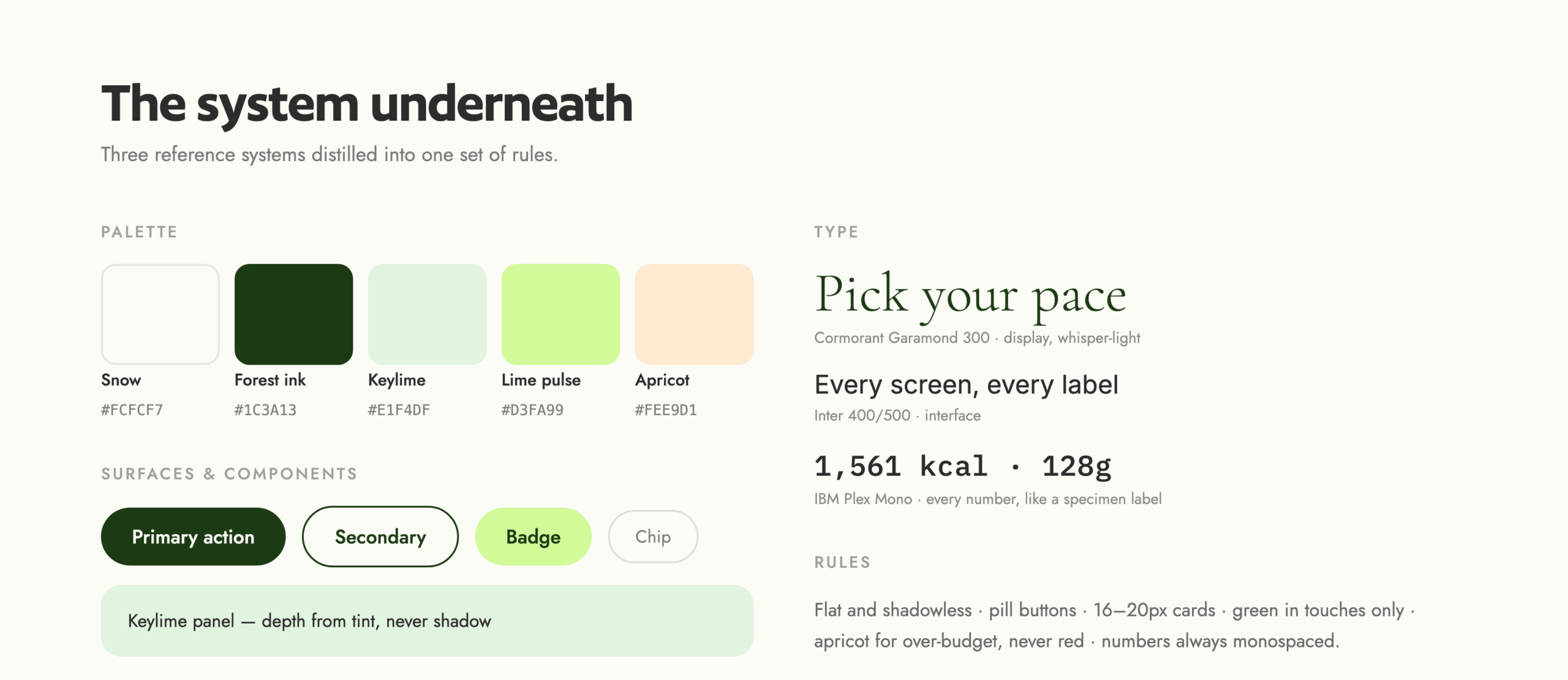
For the look, I didn’t describe it in words — I gathered concrete design systems and visual references and handed those over instead.
For everything else I had AI do the digging — the calorie maths, and how nine other trackers handle it — then read it all before deciding anything. Some I used, some I threw out.
Start loose, then converge. I opened with a rough idea and worked through it in conversation: what it’s for, who it’s for, which features earn their place. Questions I hadn’t thought to ask came up early, and the vague version turned specific before anything got designed.
Give references, not adjectives. Asking for “clean and minimal” gets you someone else’s idea of clean. Handing over an actual reference, and naming the part that matters, gets you yours.
Research before drawing. Nothing got designed until the science and the competitor patterns were on the table, and I had been through them.
Approve a spec, then review every pass. Every screen and rule went into a document I signed off first — then I checked each round and sent it back when it drifted.
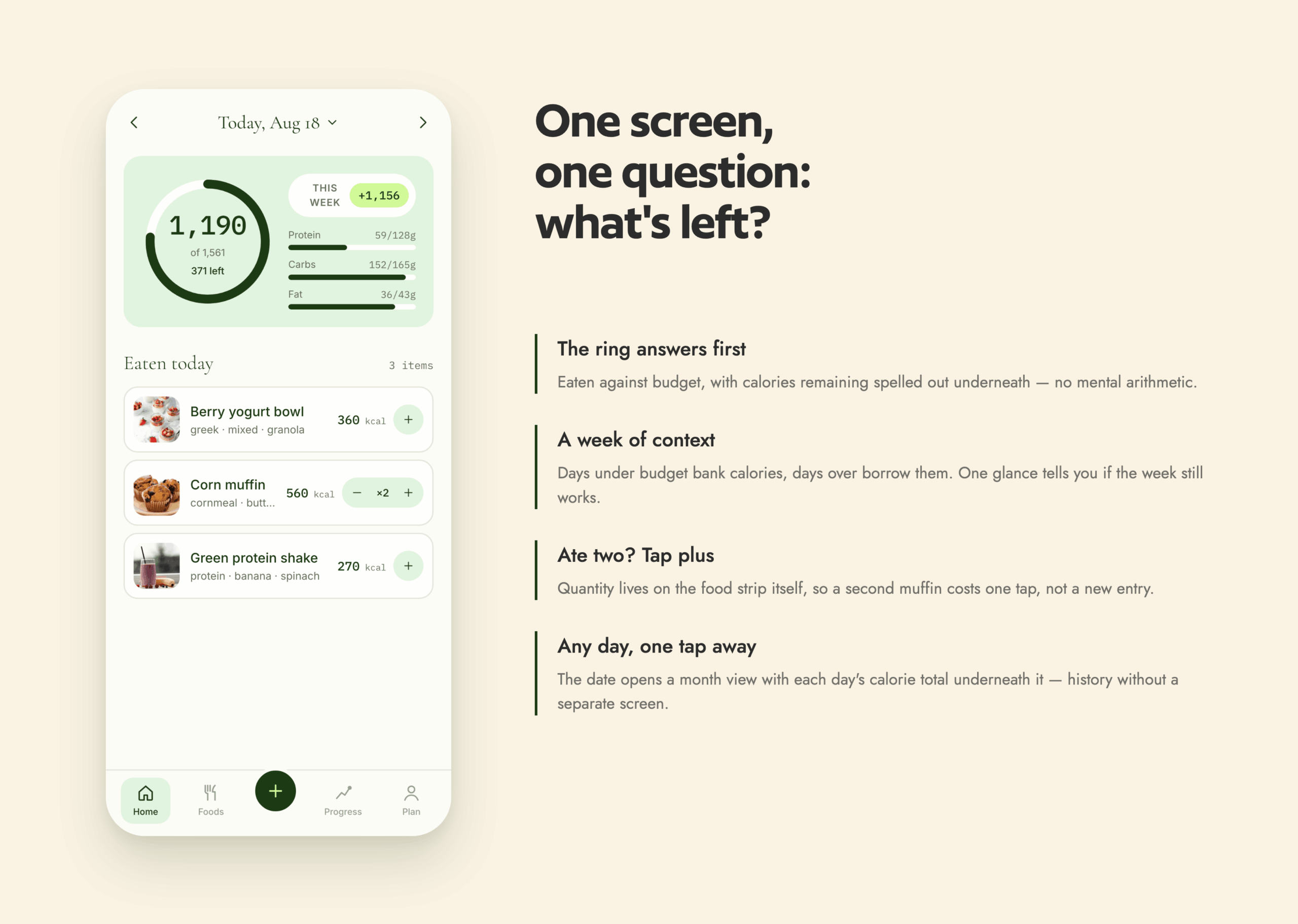
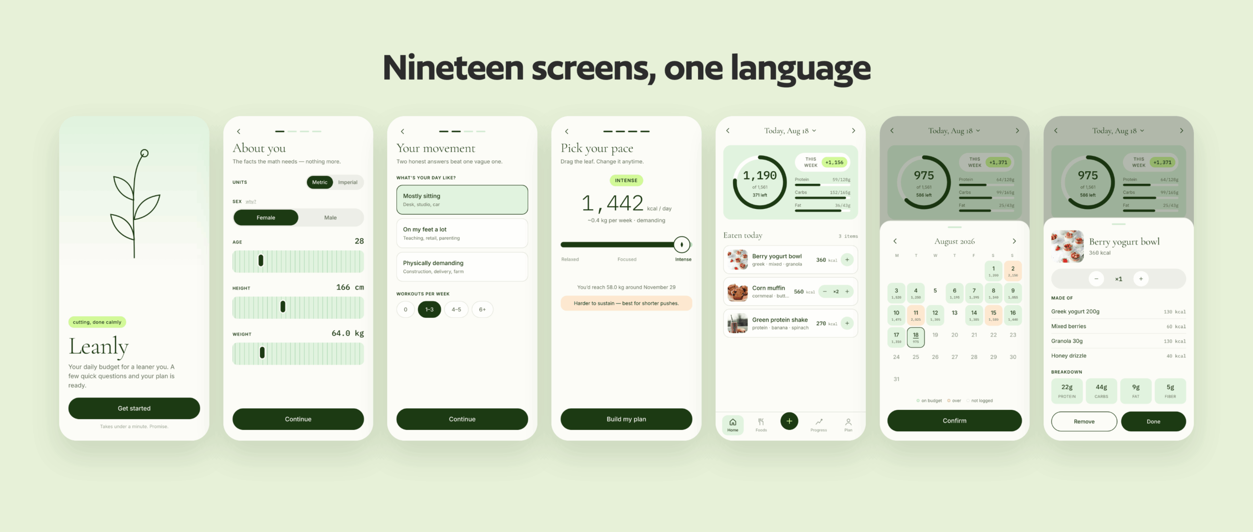
One question per screen. Home answers only “what’s left today”, with a week of context beside it — so a heavy Tuesday reads as recoverable rather than a failure.
Numbers that stay calm. I asked for figures in monospace, like a lab label; over budget turns apricot, never red; no streaks to break. This was the decision I held hardest — I’m the user, and I needed something I’d still open on a bad week.
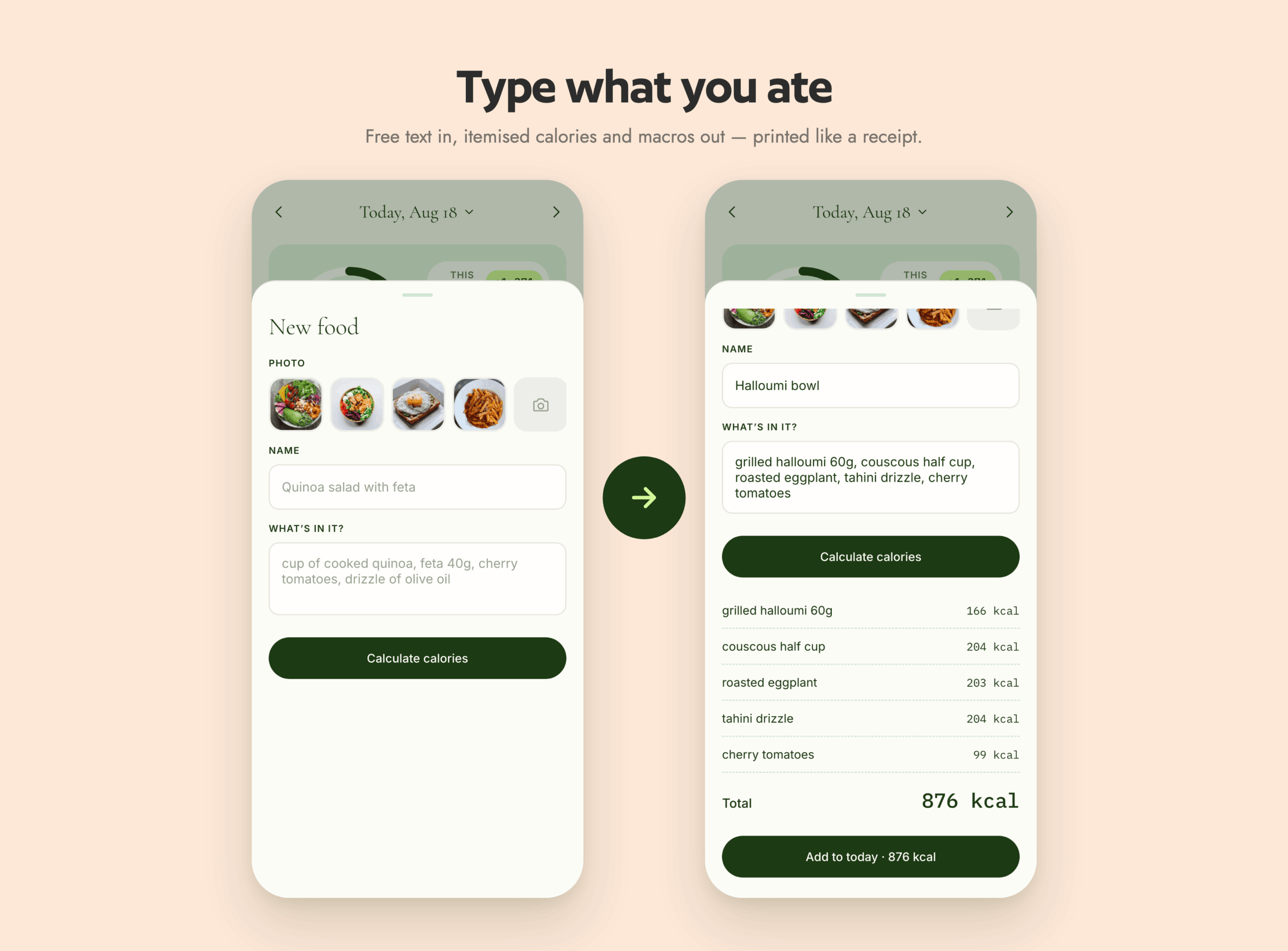
One interaction worth getting right. Describe a meal in plain language and the ingredients tally up like a receipt printing, landing on the total.
One system, enforced everywhere. Forest-green ink on warm snow white, depth from tinted panels instead of shadows, green kept to touches — pulled from the systems I’d chosen and applied to every screen.
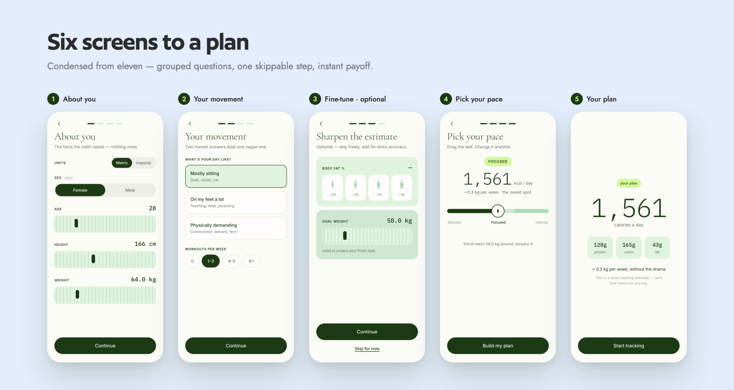
Nineteen screens across five tabs: onboarding and a personal plan, a daily home view, three ways to add a meal, a food library, and a progress tab.
Setup takes six screens and about a minute — the questions are grouped, and the ones that only sharpen the estimate are marked optional. After that the daily loop is short: open it, see what’s left, add what you ate. By search, by photo, or by typing a sentence.
Nothing to dismiss, nothing to earn back, and the thing you came to check sits at the top of the first screen.
How I asked decided what I got back. Most of my time went into working out precisely what I wanted before asking for it.
Describing every screen, every empty state and every edge case clearly enough for something else to build it gets those decisions made early instead of surfacing late.
AI covered a lot of ground quickly — the research, the calculations, the code. What it couldn’t do was decide how the app should feel, or catch when something was technically right but still wrong. That was the part I kept doing myself.