Vitamania is an online supplement store — protein powders, vitamins, gainers, pre-workout, bars.
It sells in one of the most crowded and price-focused categories in Israeli e-commerce. The brief was simple: look modern and trustworthy, without becoming just another store fighting to be the cheapest.
I was the sole designer on the project and handled it from start to finish.
Year
2024
Industry
UX Design, UI Design, Responsive Web Design
Tools Used
Figma, Photoshop, Illustrator
Standing out in a market full of look-alikes.
The Challenge
Supplements are really hard to shop for. There are hundreds of products with similar, technical-sounding benefits, and most people don’t actually know what they need. They know a goal, not a product.
The market makes it harder. If you look like everyone else, you disappear — you become a store people open only to compare prices.
So there were two things to solve:
- Navigation — help people who aren’t experts choose with confidence.
- Brand — look different and trustworthy in a category that is loud and all about price.
Research & Discovery
I looked closely at the leading Israeli stores.
The same patterns came up almost everywhere:
- Everyone competes on price — “cheapest in Israel,” constant sales, 1+1 deals. A race to the bottom.
- The look is loud and very “gym-bro” — heavy reds and blacks, shouting text, a masculine tone that leaves out beginners, women, and people who want general health.
- The layouts are cluttered — products dumped into dense grids with almost no guidance.
The hardest part for customers is simply choosing — and no one was helping with that.
Strategy
The idea was simple: don’t try to be louder than everyone else. Do the opposite — be the friendly, easy-to-use store that actually helps people choose, and make it look that way.
1. Browse by goal, not by product name.
The store is built around what people want to achieve — muscle gain, cutting, performance, immunity — instead of expecting them to already know the product. It turns a huge, confusing catalog into a clear path.
2. Stand out by being bright, not loud.
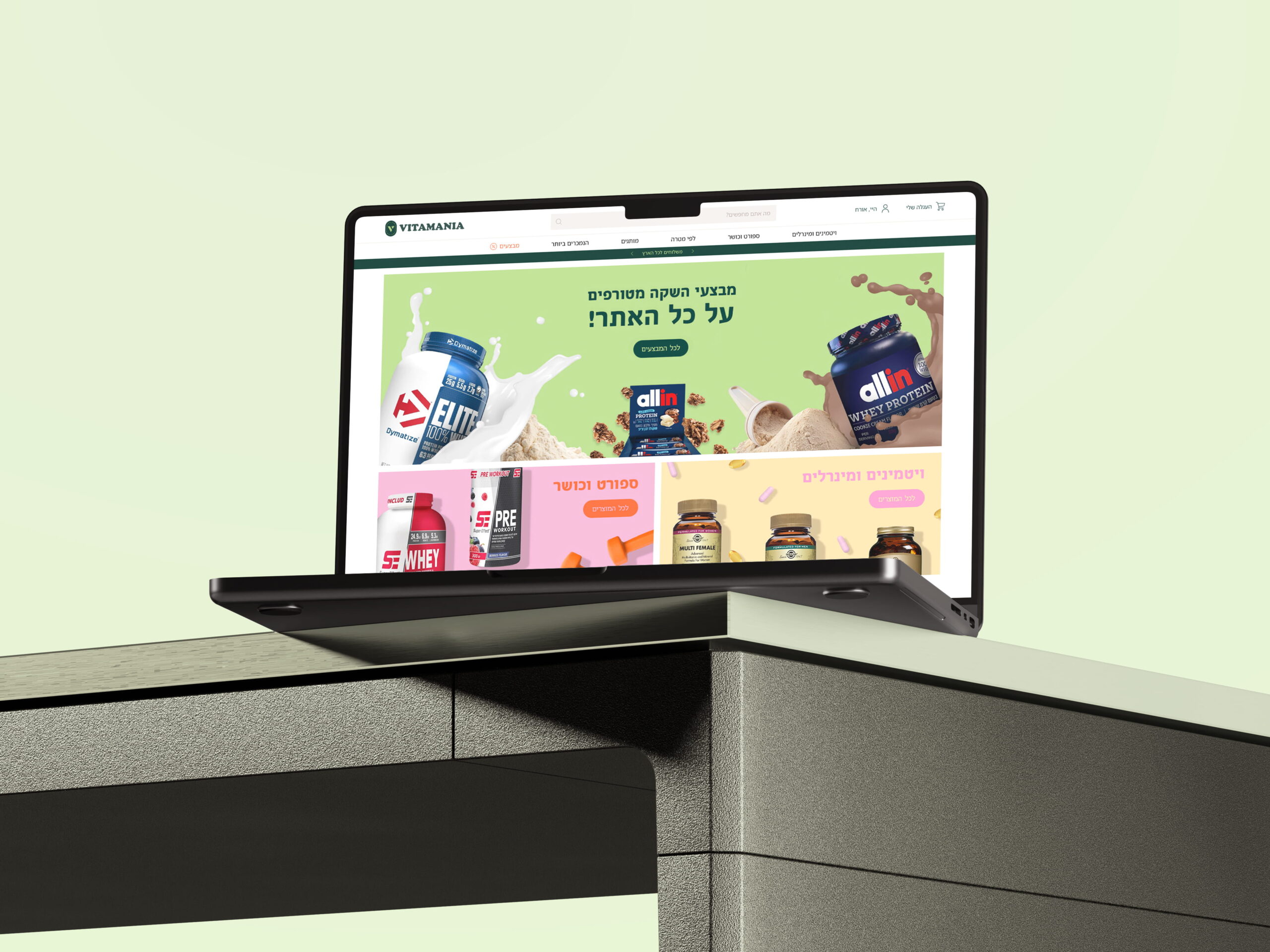
Against all the red-and-black shouting, I used the brand’s colorful, energetic palette to feel modern, friendly, and open. A store that feels welcoming to anyone working on a health goal — not just serious lifters.
Clean where it counts. Clear hierarchy, readable text, consistent layout. The color brings the personality; the structure brings the trust.
The Result
The final store feels clearly like Vitamania — modern, energetic, and friendly — in a category where most stores look loud and the same. And browsing is built around the customer’s goal, not the catalog.
Vitamania’s CEO, Roni Burd, summed up the impact:
“Val designed a site for me at a very high level, and the feedback from people who visited matched that. She has a professional eye and a touch that makes a real difference. For anyone who wants a website at the highest level — especially people working in a competitive market who are looking to stand out — Val is the address.”
Roni Burd, CEO, Vitamania
What I Took From It
Standing out isn’t about being louder.
It’s about noticing what a whole category does the same way, and choosing where to do it differently.
In supplements, everyone competes on price and volume. The thing nobody solved was helping confused people choose. Designing against what the category usually does — instead of just making a prettier version of it — is what made the store feel different.